


Domain Name Wire gets a clean and responsive design.
 Notice something new at Domain Name Wire today?
Like, the entire site?
I’m very excited to launch the new look of Domain Name Wire. It’s been a very long process, but I’m happy with the result.
I think you’ll find the new look a lot cleaner and easier to consume.
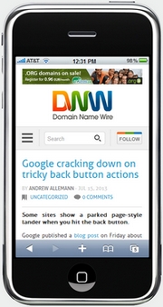
The most important new feature is that it’s a fully responsive design, meaning you can easily view the site on your desktop, tablet, or mobile phone.
I’ve also added a “Top Stories” section to the left column. You’ll notice the site now (finally!) has nested comments as well.
As with any site redesign, there are sure to be a few kinks here or there. I’d appreciate you either posting a comment here or emailing me about any problems you find: editor -(at)- domainnamewire.com. Please include the browser and device you are using along with your feedback.

“Notice something new at Domain Name Wire today?”
You mean the logo that looks confusingly similar to Adam’s “DNN” logo?
Send me a C&D 🙂
@Andrew, Adam has to send me a check first. Could be a long wait.
I like it! The only thing I don’t like is how the logo touches my browser’s left side because the logo has no left margin and how the banner touches my browsers right side because the banner has no right margin but that could just be me being a picky web developer. 🙂
Thanks Tia. What resolution are you using?
1024 x 768
Another thing: this layout looks more like a blog versus the old layout. Comparing this layout to your old layout from archive.org, I think it’s how the navigation was placed. This one is squished up into the top left with the vague ‘categories’ label. The old layout’s navigation was spread out and easier to locate the different sections.
My stats showed that few people ever clicked on the category sections, so I figured they don’t deserve as much real estate.
I like the new DNW, the overall feeling is that it looks more modern. Congrats, Andrew!
Congrats on the relaunch. The new design looks great.
DNW logo touching left edge as she mentioned.
Font is really hard to read.
Overall nice job.
Nice work Andrew. Congratulations!
I like it! You must have read my article, Go Mobile ‑ Try a Responsive Theme! Either way, you, besides me and Rick Schwartz, have joined the ranks of Warren Buffet, Disney.com, Engadget, Cisco, Snapple, Paramount, and Microsoft in broadcasting from a responsive theme.
Here is where you can view the tablet/iPhone landscape and portfolio modes of this page:
http://ipadpeek.com/?url=https://domainnamewire.com/2013/07/15/introducing-the-new-and-improved-domain-name-wire/
Good job!
looks good, would suggest u change your avatar/image that feeds the domaining platform 2 resemble your new brand.
Just being honest here, but the logo looks kind of blurry to me and almost looks like something written in Thai.
I’m also not a fan of how bold the text is on the site. It’s too ‘in your face’.
Just opinions, here. 🙂
I should add, that for me, the left column is two-thirds the size of the center column. It just seems very odd.
If you have your browser at full width then the left column is a little over half the size of the main column. If you shrink your browser then the left column squeezes.
When I arrived on the front page today (first time in a few days) I thought I was on DNN instead. The new logo absolutely reads as a DNN and not a DNW. Please re-think the logo!
@ Maggie – I appreciate the feedback. I never saw that when reviewing the logo, since the W is in a difference color than the N.
Love the white, clean background. Love the full responsive design (full bleed to the borders. Unfortunately, really don’t like the logo. Not clear. WordPress?
Too much white space…looks like someone spilled clorox all over the site 🙂
Reminds me of the logo at http://www.wwmi.com/
Site design is great. Like the responsive thing. Logo read DMV to me at first glance. Also made me think of a cool license plate a friend of mine spotted once:
“WMWMWMWM” which is of course chosen intentionally to be really confusing to read.
Of course the more I look at the logo it starts to read DNW, just not at first glance with eyes that have never seen it before.
Congrats Andrew. Overall looks good on an iPhone. Logo is blurry though. Haven’t checked on a desktop yet.
9 ads above the fold is impressive (and a bit overpowering, making the content box seem “small”).
Also not a fan of the logo. DMN? 🙂
Color is nice and pleasing on the eye.
Site redesigns are not easy and you are not going to please everybody, so read the comments and get a feel for the main distraction and fix it. It appears to be the logo at this point, but it’s only a logo. Your great content overrides a confusing logo 😉
I have to agree w/ David about the white space. It’s disconcerting. Could you possibly widen the margins for the center column?
I liked the design but too many ads above the fold may impact your Google ranking.
Good work Andrew.
I really like the new design.
Responsive all the way as far as I’m concerned. It’s worth doing just to reduce the bounce rate of your mobile traffic.
I’m on 1920*1080 and it’s perfect for me. White space isn’t disconcerting, it gives clarity and focus to the actual content in my opinion.
Thanks Sam
I like the new design better than the old. I don’t see any problem with the white space (I’m at 1920 x 1200) and now there’s plenty of room for more ads.
But the logo! I keep thinking it says DNN and I think it’s because the start of the W is at an angle, and with the letters all running together the green-blue isn’t enough of a contrast. When I look at the grayscale version in the lower right corner, I do see DNW. You could just disconnect the letters from each other too.
I don’t think I got this sort of feedback when I originally posted the logos, but it’s probably different when you see it on the actual site. I’ll have to play around with it.