


Sedo launches a more mobile-friendly website with better Chinese language support.
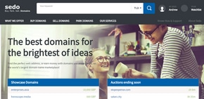
The company also added better support for Chinese-language customers.
The backend where clients manage their domain names, as well as the process for submitting offers and negotiating for domains, doesn’t appear to have changed other than a new navigation header. When someone submits and offer, the first page is mobile friendly but then it reverts to the old design.
Going mobile was obviously a big requirement for Sedo, and it’s good to see that the company took a big step forward.
If you’ve checked out the redesign, what do you think?

It’s ok. Seems like a lot of wasted space and some UX could have been better. At least they’re trying and it’s better than the 90s garbage they had before. https://sedo.com/search/details/?domain=energy.com
They also added some graphical snap to the landers of some of the nicer names but again. It seems a bit like a waste of space and not getting the customer to the finish line.
The home page seems very, very long. Some good stuff, some that seems superfluous. Extension of the month doesn’t make much sense to me how it’s currently implemented.
I agree that it’s a major step in the right direction, though. Will be awesome when the entire make offer process is mobile friendly.
New “BIN” landers look great: e.g. http://blackjack.world
Do my eyes deceive me? Is that a parking template without PPC ads? I certainly hope so, as that’s a feature I’ve been petitioning both Sedo and Afternic for for some time.
Anybody know how to set that up?
It’s a lander for Buy It Now 😀
Ah, so it’s a case of the domain owner forwarding the domain to the BIN page at Sedo … and not an option to be selected within Sedo.
Yeah 😀
Nice. Not quite responsive however
The lander is responsive. Except, in this example, it’s been included in an iframe (by its owner). This approach breaks the device viewport.
If you visit https://sedo.com/search/details/?domain=blackjack.world it is responsive.
Looks pretty, guess I will have to return to the desktop to use it.
Truth is too much white space and the new flat “look” are examples of not understanding classic human factors and ignoring basic eye strain. The BIN landers have much space for mostly N/A facts.
I prefer clean design with strong focus on the lead. Good examples are DNS landers or the new Nextnames site, e.g. https://nextnames.net/domain/hdhub-com