


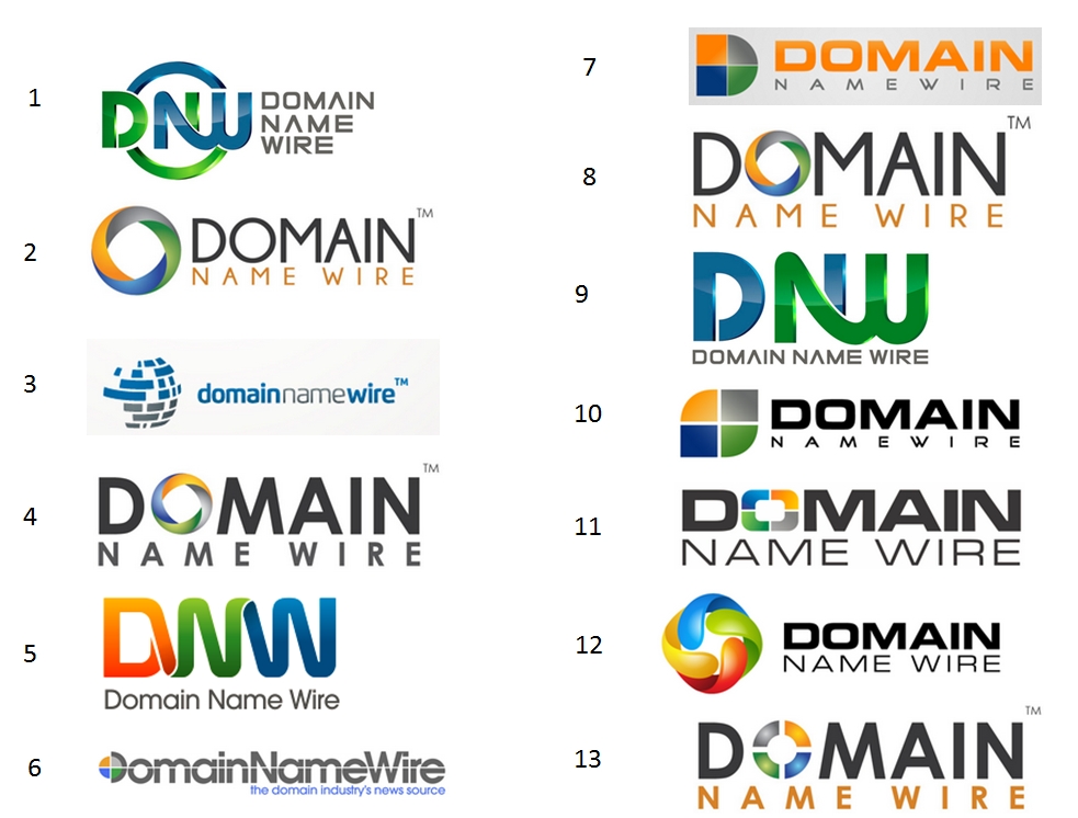
Help pick the next logo for Domain Name Wire.
![]()
I’ve learned a lot with this logo contest, and I’ll share some of my insight later.
But for now, I’d like your help. Please take a moment to look at these 13 logo designs and let me know which ones you like best (or hate the most).
“They all suck” isn’t quite as helpful, but I’ll take all feedback.
Keep in mind that I’m in the process of redesigning Domain Name Wire, so you don’t need to worry about how well the logos fit with the current color scheme. Also, if you really like a logo but not one small thing about it, I can still get it tweaked.
Thanks.

I like #5
I prefer #4. I like bold letters with the name prominently displayed.
#5
I prefer 5, 6 and 11, but I don’t think any of them are quite right.
“Wire” is key to your brand. That’s the word that sets you apart from all the other blogs in the space. It should be emphasized in the logo.
Yet most of the logos emphasize ‘Domain’ and bury ‘wire’. Someone looking at those logos focuses first on the word “Domain” so it’s not immediately clear which domain blog the logo is for.
Thanks Nat. I’ve received similar feedback, and am thinking of ways to make the Wire more prominent.
The concept of the blending logo’s with #1 and #9 look pretty cool. Many companies are trending to blending if you will.
#3, 5, 6, 7 and 12 = Look too cookie cutter.
#3 resembles communications or AT&T
#13 resembles Google or Firefox add-ons.
#7 needs to lose the grey box.
My vote(s) would be for #10 and #13. Personally #11 would be my first choice if “Name” and “Wire” were changed to orange as #13 contains. Makes it stand out better.
Just my personal opinion of course. Thoughts?
#1
I like #6, but this seems like a good opportunity to start branding as DNW.
I think number 5 is best suited since it perfectly represents a wire.
Number 1 looks good as well.
Whatever logo you choose, make sure that your logo works well in black on a white background and in white on a black background (colors should never be essential to understanding your logo).
3,11
I like #4 and #10. With #10, I think there should be a space between “name” and “wire”.
5 is the best of the bunch but I’ve seen that ribbon effect done a lot lately. It’s trendy . . .which carries good and bad.
The rest are terrible font selections . I also gree with Nat about “wire” being your distinguisher. . . and the emphasis in all the “stacked” logos being Domain. It almost reads as Domain, Name Wire as a result of that handling. Weren’t you looking for a more horizontal format like your current one ?
@ Adam – my instructions were “landscape”. It would be nice to get something that’s not as wide as the current logo, but I agree with the general feedback that the focus needs to be on ‘wire’, or the entire term. Maybe someone can even stack “Domain Name” and put wire next to that as the bigger font.
Agree with Nat Cohen,
The word “wire” is not being utilized, thats the word that makes me think of your site and should be the focus of your logo,and not just in wordage but in the graphics also.Keep looking.
The O in #2,#4 & #8 are recycled from some other logo, which of course I cannot remember at this time.
I guess it depends on what brand you want to move forward with. If you aren’t going to rebrand yourself as DNW then I would exclude those. It muddies the brand otherwise.
Personally, I like #6 best even though it may be the simplest. I would bolden the colors though to make it pop a bit more.
I like 3 and 6 the most.
#5
not even close
good job
I like #10 and agree with Josh that there needs to be more of a space in between the two words.
6, 10, 11
2 or 5.
as in the sentence DamN why’re you doin’ this? they’re all pretty bad. as a former graphic artist i gotsta tell ya. keep workin’ on it.
RaTHead, the guy who refused to design a logo but always wants to provide his commentary 🙂
Number 5…hands down.
The stand-alone DNW graphic mark is strong, memorable, creative, and contemporary. It is the only mark of the bunch that unifies the three letters in one image, and does so with graphic appeal. It’s a keeper.
Vote: #5
Comment 14: I agree with you on that… Your company name is really in two parts – Domain Name + Wire. That is how the setup should be divided. Also, the only graphic that makes sense to me is #7 – the ‘D’ looks great.
If I had to choose one it would be #5.
I like the way #11 looks with the icon as the O. I would use that same exact font but place the words next to each other like in #3. Have them do 2 variations, one in lower case and one in upper case to see how it looks and also a variation with the first letter in each word capitalized also. Have them also do a variation of upper and lower case with the #11 icon placed next to the name like in your original logo. I don’t agree with making wire stand out from the rest. All 3 words are important and none need to stand out from the other.
#5
I like 4 first, followed by 13.
#5
#12 Logo in #11 Text.
#12 logo design is a keeper for sure.
Good Luck!
I think you should stick with status quo ante.
The old logo beats all of them.
#4 or #6
#1
modern and elegant
#3
Try it capitalized. Which may look even better.
At a glance, #5 looks like DWW and #1 looks like DNJJ… You don’t want a logo that’s at all confusing to the eye
Word of advice; DON’T take the word of competing blogs and forums since most are out to out-do the competition.
I like #11, I think it goes well with long company names and it’s the cleanest looking of the bunch.
Good luck with it Andrew 😉
Really doesn’t matter which one you pick aside from ease of using it if you need to print old timey business cards or shirts or something. That and ease of making a color scheme on your site.
That said I like #9
Thanks everyone for your feedback so far.
Here’s how I’m “hearing” things:
1. “wire” is an important part of the brand, so it needs to be visible or a focus of the logo.
2. Some people think the new logo should retain some of the old, i.e. something visual that reminds you of the four colored circle.
3. People are split on whether or not DNW should feature prominently in the logo/brand.
2,4,8 are my favs, hands down..
There is way too much happening with every one of these. Restraint is needed. The four colours (too much) do not help.
I would say you need some help with the brief.
Nic
# 11
Keep up the good work!
#6 is good…
Has no gradients… which are a challenge with signage, embroidery, and other forms of branding.
#5 does stand out. The ribbon effect can tie-in with the wire idea. The word WIRE should be made to stand out either as darker, or gold, etc. Or reverse the colors of DNW and then the word wire to match fiery orange.
#6 is by far the best IMO. I think the “D” needs a little work, but it is really well designed. I like the whole name spelled out. I think when you break the name up – it changes the feel for the whole site – not is a good way. Best of luck with the redesign!
Andrew, lots of great input here.
My preference is for #3.
Number 3 appears modern and mature – I think it reflects the growing up of the Domain Name marketplace into a mature industry. The design is, perhaps a little less “playful” than some of the others, it does what a business logo is supposed to – even without the beachball look.
None…they all suck.
General thoughts:
– I would not highlight the word ‘wire’; but rather just ensure it is not de-emphasized (as it is in many of the logos above). My preference would be to have “Domain Name Wire” all in the same font/size.
– I think it is important to have some continuity with the old logo (i.e. the 4-color ‘wheel’).
Given the above, my preference is for #7 (but with simplified text):
– I like the continuity of the stylized 4-color ‘D’ (born from the old 4-color ‘wheel’);
– But, would suggest the “Domain Name Wire” text be all the same font/size/color;
– Also, I would request both a linear version & a stacked version.
Cheers,
Steve
No question about it, #6 is my clear favorite here. It’s neither overly-stylish nor too basic. I like how the logo is incorporated with the “D” (instead of the more obvious “O” replacement), and how the line bisecting the logo and letters is perfectly aligned with the top of the bar in the “e”s in the logo. It seems like the perfect evolution of the current logo.
5, 10 and 11
I like number 9 but I would change the color of the letter d to orange and I would change (blend) the first part of the letter n to blue.
2 & 3
6
5th one is recommended.
#5 by far from the options listed here.
The rest ar from the 80’s (sorry about your designer/brand strategist).
Puiu.
I like #2
I think simplicity is the best approach. All the logos shown have lots of colors that does give distractions and less impact overall……
In principle, any logo design should be maximum of 3 colors…. 1 or 2 colors is the best approach for example famous logos of Coca Cola, McDonald etc…..
Have a look at NAMEii.com logo which has a strong and powerful impact of black and red with minimalist approach….it is simple, clean and direct……..
#5. Would look better IMO if the ‘wire’ between the D and N linked from the bottom stroke of the D rather than the center of the D as pictured.
I’ve learned that you can rule out logos easily by reducing sizes like you have done. Whatever is unclear at all gets eliminated right away and that would be 2, 3, 6, 7, 9, and 12. #1 would be ok if DOMAIN NAME WIRE was about 30% larger. #4 should have something done with the O in DOMAIN as it is not dynamic enough. #5 is problematic due to choice of font not being clear – if this font is desired, contrasting hues rather than complementary ones should be used. In #8, the NAME WIRE has insufficient content. #10 looks odd due to text justification. #11 would benefit from greater contrast in the O. #13 is probably the best if you had to pick any without changes, but I would rather see functional changes on one of the others.
11
#5
#2
11 or 13. Have them play with both fonts and colors for both of theses. Then break it down from that point. 11 is better than 13 but the o in the word domain will be your mark. Make it cool.
11
My favorites are #2, #8, & #12. I find the circular, toroidal rings in those logos most appealing over the others.
#5 is way too confusing with DNN.
#10 is like every logo and board game I’ve ever seen.
hope this helps.
Surprised so many picked #5. I guess I have nothing against it, other than when I look at it, I see DNN. I would not want the slightest chance of being confused with another prominent domain blog. The way that green flows into the blue, for those with a degree of color blindness, could be especially confusing.
@ Mike Curving –
“another prominent domain blog”
If you’re referring to DNN, it’s not a “prominent” blog.
Zzzzing!
(that was for Adam. I get your point.)
“#5 is way too confusing with DNN.”
aha SO, that’s what makes it awesome !!
“DON’T take the word of competing blogs and forums since most are out to out-do the competition.”
yes. we have no shame in trying to make Andrew change his logo to be confusing so we can reap the massive rewards
#11
#5 is BY FAR the best
#3. Distant 2nd: #10.
If this were mine, I would work off of #11.. and incorporate a wire into the design, One example is this one;
http://wessmandesign.com/asp_scripts/print_image.asp?WebsiteID=45529&GalleryID=164477&MediaID=3249556&Print=0
I trust this is what you tried to do with design 1, 5 and 9.
Andrew, that got me laughing 🙂
#6, but in needs more work.
I luv # 12 (hands down)
although it looks a little Googleskian 🙂
And I was having “logo problems” now I am going to give them a try, please share what you learned…
I actually like # 12 as the image reminds me of strands of wire that are intertwined. The Letter could be a bit more Bold though….