


Four ways to improve the Sedo bulk bidding interface.
If you missed the conclusion of Sedo’s December Great Domains auction, you missed some great deals. I picked up five good domains at nice prices. Don’t say I didn’t give you a heads up.
This was the first time I was bidding on multiple domains that closed at the same time on Sedo, so it was my first experience with Sedo’s “bulk” bidding system. It worked fine, but there are several ways it can be approved.
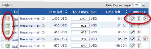
First, the good stuff. The interface it clean and loads relatively fast. The graphics on the left of each domain were intuitive: green means I’m winning, red means I’m losing, and yellow means the reserve isn’t met. Also, the domains are ordered by closing time as a default. That makes sense.
Now, here are a few ways to improve the interface:
Don’t make me agree to terms with each submitted bid. Perhaps because of its legacy offer/counter-offer system, every time you submit new bids you have to check a couple boxes. You’re agreeing to terms and conditions. But this adds steps — and time — to the bulk bidding process.
Add an “up” arrow to increase bids to next minimum bid increment. I kept getting an error when I submitted a few bids at once. The error message informed me that one of my bids was too low. I triple checked and found that my bids were all higher than the existing high bids. I finally deduced that one of them didn’t meet the next bid increment, even though it was higher than the current bid. Sedo could take a play out of the SnapNames playbook here. SnapNames has a little button you can click to increase your bid one “increment” above the existing bid. It’s rather intuitive.
Make error messages specific to a particular bid. See the previous recommendation. I was submitting three bids at once, but got a generic message that my bid was too low. It didn’t identify which bid was too low. If the message was directly below the domain at issue (or specified which one), it would have helped me figure out the problem much faster.
Create tooltips for the icons on the right. The icons to the right of the screen (see red circle) aren’t very intuitive. Who knew that a pencil lets you enter alerts? Add some tooltips that show when you hover over the icons.
Now, I’m not complaining. I got some great deals on five domains, and obviously I worked through the interface fine. But when I get carpal tunnel from checking all those confirmation boxes, you know who I’m calling.

Did you end up with Heists.com ?
Such a cool name.
I watch the show “Masterminds” … it’s about heists and genius criminal plans.
Heists would be a cool site to highlight incredibly well planned crimes.
Watch Masterminds — its on TRUTV during the day.
Aron – yep, got that one.
Looks a great improvement.
whadelseja get ?